
CASE STUDIES
Explore a selection of my more recent design projects. Each case study tells the story behind the work including project and client overview, challenges, and creative solutions. From brand identity package design to print and digital materials, these examples show how design can solve problems, connect with audiences, and bring ideas to life.
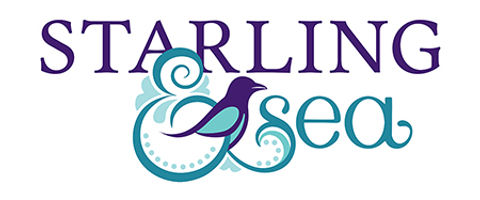


Starling & Sea
BRAND IDENTITY PACKAGE DESIGN
VIRGINIA BEACH, VA
OCTOBER 2025
OVERVIEW
Starling & Sea is a creative business that offers original artwork, prints, and illustrated products inspired by the coast and nature. I worked with the founder to develop a complete visual identity for her dream business.
CHALLENGE
The founder for Starling & Sea is an artist herself, and was looking for a creative and original brand identity for her product line before she can began marketing herself and her heartfelt illustrations to local businesses.
SOLUTION
The result is a logo that is timeless, whimsical, and elegant. By blending the two words in a unique and visually appealing way, along with using flourishes around the “&” which are reflective of Czech folk art and a nod to the artist’s heritage, I created an original and unique design. The jewel tones are cool and inviting, similar to the tones seen in a starling’s feather, while also giving seaside vibes.
As part of the branding package, I provided the client complete branding guidelines, including secondary and brandmark logos, color palette, fonts, backgrounds and patterns, and brand visuals. These guidelines help her see the scope and potential of her brand when marketing herself through her website and social media.


CodeHunter
CORPORATE BRAND DEVELOPMENT
VIENNA, VA
APRIL 2023–TODAY
OVERVIEW
When I joined CodeHunter as their exclusive freelance designer, they had a strong mission but no clear visual identity to match it. I was tasked with shaping a strong, cohesive brand identity that could scale alongside the cybersecurity company’s rapid growth. The goal was to create a visual identity that would communicate expertise while staying modern and adaptable for many audiences.
CHALLENGE
Cybersecurity is complex and can feel intimidating and overly technical to many potential clients. The brand needed to project authority in the industry without alienating non-technical decision-makers. Additionally, the company’s materials at the time lacked a consistent look and feel—marketing collateral, event displays, and digital assets each followed their own style, weakening brand recognition.
SOLUTION
I developed a comprehensive visual identity, including logo refinement, typography, color palette, iconography, and layout guidelines, ensuring the brand worked seamlessly across print and digital platforms. From there, I rolled out the new look across everything from brochures, infographics, trade show displays, social graphics, and presentations for both internal and client use. By maintaining consistent visuals and messaging, the company has established a strong, recognizable presence, built trust, and now stands out in a crowded industry.


Wild Hearts Pet Collective
BRAND IDENTITY PACKAGE DESIGN
FALLS CHURCH, VA
APRIL 2025
OVERVIEW
Wild Hearts Pet Collective is a new small business committed to providing compassionate, high-quality care for pets and their people. I worked with the founder to develop a complete visual identity that reflects their values of trust, warmth, and compassionate pet care.
CHALLENGE
The client wanted a brand identity that would stand out in a crowded pet care market while still feeling approachable, trustworthy, and personal.
SOLUTION
We began by exploring brand positioning, tone, and visual inspiration. The final logo blends hand-drawn elements with clean, personalized typography to balance playfulness and professionalism. Bright orange and teal were chosen to evoke a friendly and fun color palette. Supporting brand elements and patterns were created to extend the identity across applications, from social media to branded digital and printed materials as well as apparel.
The new brand identity gives Wild Hearts an original look and feel to support the small business as it grows in size and popularity. The visuals communicate quality and care, helping build trust with potential clients.


Cherry Blossom Ten Mile Run
RACE T-SHIRT, SIGNAGE, & MEDAL DESIGN
WASHINGTON, DC
MARCH 2021–SEPTEMBER 2021
OVERVIEW
The Cherry Blossom Ten Mile Run is an annual Washington, D.C. tradition celebrating the arrival of spring with tens of thousands of runners filling the city’s iconic, blossom-lined streets. The race committee holds a contest every year for anyone to create a fresh, new t-shirt and medal design. In 2021, I won the contest when a board of race directors, elite participating athletes, and members of the sponsoring credit union chose my design.
CHALLENGE
I wanted to create an original design that was clean and bold, emphasizing the race distance. My design also had to appeal to a to a broad range of some 30,000 participants, from first-time runners to elite athletes.
SOLUTION
Hand-drawn cherry blossoms and the Washington, D.C. skyline were woven into the words to create a cohesive and unique design. A fresh color palette evoked the seasonal pinks and soft neutrals of the blooms.
My design was chosen in January 2021. When hopes of having the race in-person that April dwindled due to Covid restrictions, the originally scheduled race became virtual and I was asked by the race committee to create an additional logo. When Covid restrictions lightened by mid-summer, the in-person race was rescheduled to September and my original design was used. Although cherry blossom season was over, the spirit of the race was strong, with many athletes choosing to participate in both the virtual and in-person races.


Stonecrop Health
BRAND IDENTITY PACKAGE DESIGN
RESTON, VA
AUGUST 2023
OVERVIEW
Stonecrop Health is a mental health practice founded in 2023 to provide personalized, compassionate care. I worked closely with the founder to develop a brand identity that reflects quality, individualized, caring mental health care.
CHALLENGE
As a small business entering a sensitive field where trust is essential, they needed an identity that felt both professional and deeply human.
SOLUTION
Inspired by the stonecrop plant that is known for its resilience and quiet beauty, I developed a visual identity that conveys calmness, stability, and growth. The brand package includes a custom logo, original color palette, clean typography, stationery set, front-end website design, and adaptable design elements and patterns suitable for both clinical and digital environments. Every choice was made to reinforce a sense of safety, warmth, and clarity, qualities essential to building trust with clients.
The final identity is simple yet meaningful, designed to support Stonecrop Health as they grow, connect with their community, and provide care that meets people where they are.


Homeward Trails Animal Rescue
LOGO DESIGNS
FAIRFAX, VA
2012–TODAY
OVERVIEW
Homeward Trails Animal Rescue is a nonprofit dedicated to finding loving, permanent homes for thousands of dogs and cats through rescue, foster, and adoption programs. For more than a decade, I’ve partnered with the organization and its founder to design various logos for their programs, events, and shelters throughout Virginia and Puerto Rico.
CHALLENGE
The logo designs represent a wide range of needs, from annual fundraising events and summer camps to outreach programs and rural shelters in under-resourced communities. Each logo needs to stand on its own while also feeling unmistakably connected to the Homeward Trails brand. The designs need to be versatile for digital, print, and merchandise use, and visually appealing to a broad audience of animal lovers, volunteers, and donors.
SOLUTION
From 2012 to 2025, I developed a series of distinctive yet complementary logos that combine playful, animal-centric illustrations with clean typography. Each design incorporates friendly, approachable imagery in Homeward Trails branded colors that reflect the warmth, compassion, and mission of the organization. Every logo shown here was designed to capture the spirit of the program or event in hopes to resonate with supporters while maintaining a cohesive brand presence.


EmpowerAid Consulting
BRAND IDENTITY PACKAGE DESIGN
WASHINGTON, DC
OCTOBER 2024
OVERVIEW
EmpowerAid Consulting is a new small business providing strategic consulting services in the humanitarian and development sectors. I collaborated with the founder to create a complete brand identity that reflects the company’s values of integrity and ethical impact.
CHALLENGE
The identity needed to balance professionalism with empathy by positioning EmpowerAid as both a credible expert and a trusted partner in complex global work. The founder described herself as a “straight-shooter and not afraid of a challenge.”
SOLUTION
The identity was designed to be global/travel forward, using a symbolic compass to reflect not only the founder’s personal interests, but also to be representative of power and strength. The final package included a custom logo, versatile color palette, typography system, stationery set, and brand guidelines.
This identity system gives EmpowerAid a strong foundation as they launch and grow, with a direct, clear and, consistent voice that communicates purpose and professionalism across platforms.